Conversion and utility sections
Some sections exist to move a visitor one step closer to buying. Others exist to answer a practical question before it turns into an email in your inbox. This page covers both: signup forms, popups, timers, and the utility sections that hold events, locations, app content, and your own code. Most are added with Add section in the theme editor and can be dragged into any position on the page, while two of them appear over the whole store instead and are switched on with their own setting.
Newsletter
Section titled “Newsletter”Places an email signup with a heading, short body, and a single field into any page, and addresses land in your Shopify customer list. Use it near the bottom of your homepage, or on a page where someone has just read something they liked. Layout sets how compact it sits, Icon adds a small mark above the text with Custom icon for your own artwork, and Button label is worth rewriting from the generic wording. Write a Success message that says what arrives and how often, and turn on Require a consent checkbox with clear Consent text if you market to regions that expect it.

Contact form
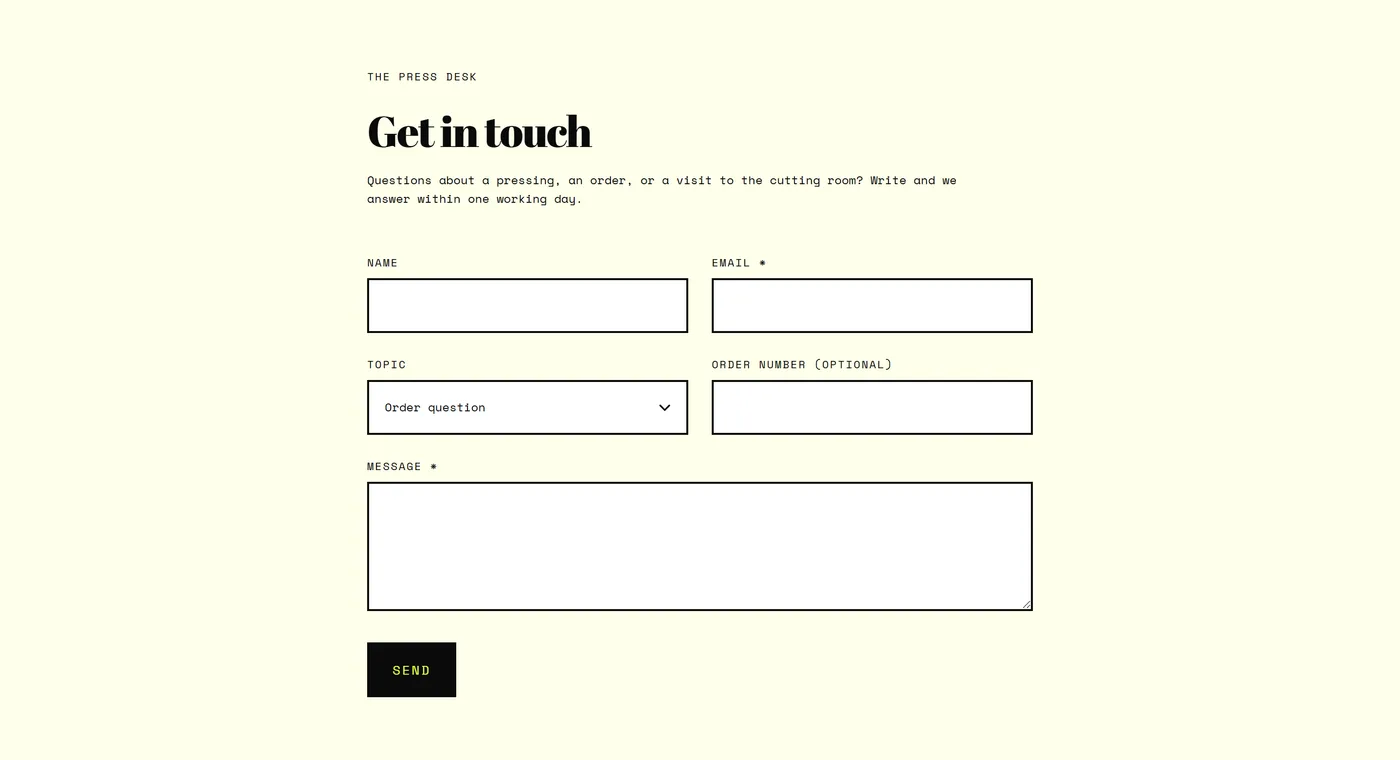
Section titled “Contact form”A working contact form you build field by field, with optional intro text and an image alongside. Use it on a dedicated contact page, and anywhere the question is complex enough that people would rather write than call. The blocks are Single-line text, Email, Phone, Multi-line text, and Dropdown. Keep it short, since name, email, and message answer most cases, then add a Dropdown when routing matters: order issue, wholesale, press. Layout and Sidebar position decide whether the form stands alone or sits beside your text and Image. More detail in Pages and contact.
Countdown
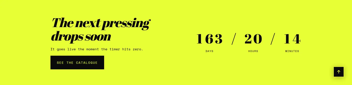
Section titled “Countdown”A live timer running to a date and time you set, with an optional Image background and its own heading area. Use it for a sale end, a product drop, or a preorder cutoff, rather than as permanent decoration, because a clock that always runs stops meaning anything. Set End date and time in your store timezone, and let Behavior decide what happens once it reaches zero. Style, Timer size, and Digit separator control how much presence it has, Show seconds raises the pressure, Always show days keeps the layout steady, and Animate digits with Digit animation adds movement.
Promo popup
Section titled “Promo popup”Overlays a single offer on top of the store, with an image, heading, and either an email signup or a button that links somewhere. Use it for one clear thing: a first-order discount, a launch, a waitlist. Switch it on with Show the popup, set Delay before showing so it waits until the visitor has seen something, and set Days before showing again so returning shoppers are not asked twice. Call to action chooses between the signup and a plain Button link. If you offer a Discount code, name the amount in the Heading. Choose this when an offer needs to interrupt, and keep Newsletter for the quieter ask further down the page.
Age verification
Section titled “Age verification”Shows a full-screen confirmation before the store becomes visible, for catalogs that require one. Turn on Enable age verification, then write the Heading and Text in your own voice and label the buttons plainly with Confirm button label and Decline button label. Remember confirmation saves regular customers from confirming on every visit. Choose Redirect visitors who decline, or leave them on a friendly Message for visitors who decline. Show logo, Image, and Image overlay make the gate look like part of your store rather than a system prompt.
Store locator
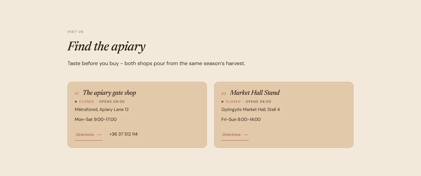
Section titled “Store locator”Lists your physical locations as Store blocks, with the details a visitor actually wants: address, opening hours, and how to find you. Use it when you have a shop, a studio, a pickup point, or stockists, and you are currently answering “where are you?” one email at a time. Layout switches between a plain list and a list beside a Map image, so you can show a branded or hand-drawn map. Use Heading and Text for the one line about parking, the entrance, or appointment hours. Pair it with Contact form: the locator answers where, the form answers everything else.
Event calendar
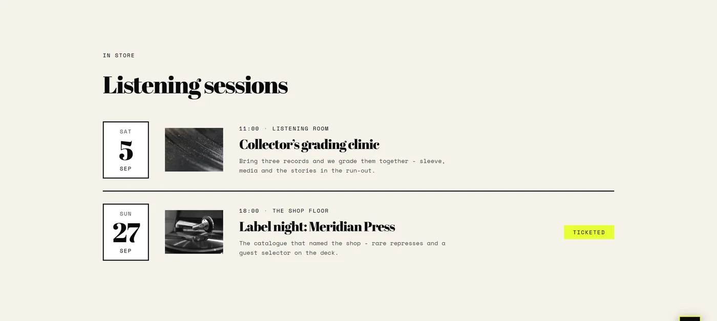
Section titled “Event calendar”A dated list of what is coming up, built from Event blocks: markets, workshops, launch nights, trunk shows. Use it when your calendar is itself a reason to come back to the site. Event order sorts the list, and Past events decides whether finished dates stay visible or step aside on their own, which means the section keeps itself tidy between updates. Write a No-events message that still sounds like you for the quiet weeks. Choose this over Blog posts when the content is short and dated rather than something to read.
Blog posts
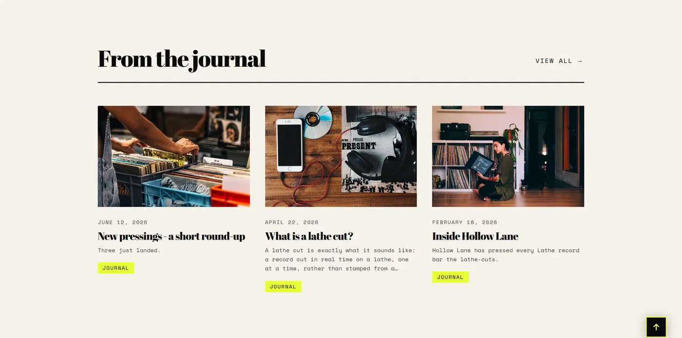
Section titled “Blog posts”Pulls recent posts from a blog you choose and shows them as cards. Use it on the homepage when you publish regularly, and on landing pages where a guide or a story supports the products above it. Blog picks the source and Blog posts to show sets the count, while Layout and Columns on desktop shape the row. Auto-rotate blog posts with Speed turns that row into a slow carousel on narrower screens. Show image, Image ratio, and Category tag control how much each card carries. The full guide is in Blog.
Custom Liquid
Section titled “Custom Liquid”An empty section you fill with your own markup, or with a snippet a service has given you, without editing theme files. Use it for a one-off embed such as a booking widget or a form from another provider. Paste the code into Custom Liquid, then set Color scheme, Content width, and Section spacing so it sits inside the same rhythm as everything around it. If the app you are adding offers a proper app block, use Apps instead, since blocks are far easier to move and remove later.
A host section for app blocks, with its own heading area, so app content appears exactly where you want it on the page. Use it for reviews, loyalty widgets, size guides, or anything an app provides as a block. Add the section with Add section, then add the app’s block inside it and drag the whole section into position. Caption, Heading, and Heading alignment let you title it in your own words, and Content width with Section spacing keeps it aligned with its neighbours.