Product and collection sections
These sections are how your catalog reaches people who are not already browsing a collection page. They pull products and collections onto your homepage, onto landing pages, and onto the product page itself, so a shopper always has an obvious next thing to look at. Reach for them when you want to steer attention: a seasonal edit on the homepage, one hero product on a campaign page, or a row of related items under the buy button. Most of them are added with Add section in the theme editor, and you can drag them into whatever order tells your story best.
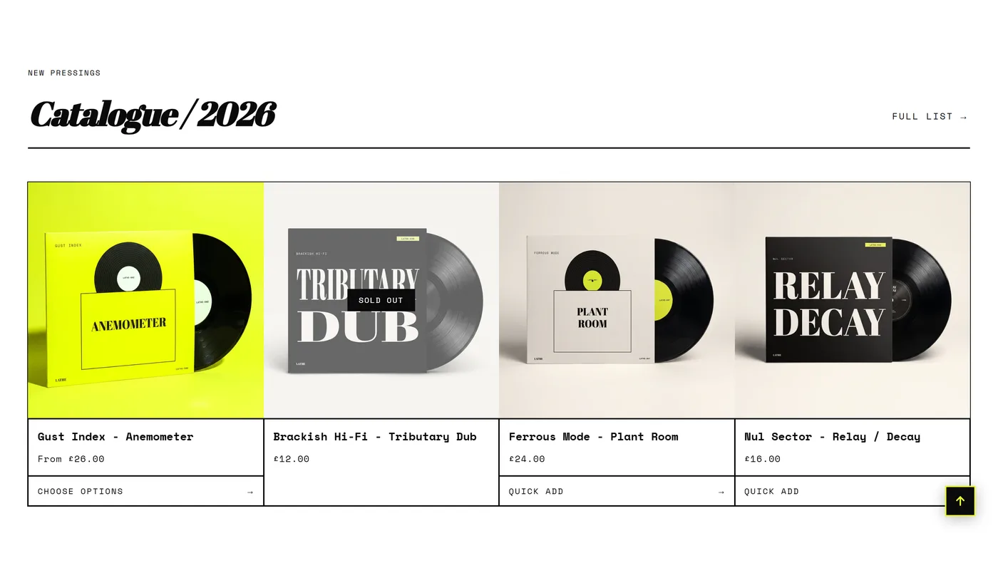
Featured collection
Section titled “Featured collection”This shows a set of products from one collection you choose, which makes it the workhorse of most homepages. Use it to put your bestsellers, a new drop, or a sale group in front of people within the first screen or two, rather than asking them to find the collection themselves. Collection picks the source and Products to show caps how many appear. Layout decides whether they sit in a grid or a row that slides, and when they slide, Auto-rotate products and Speed move the row on its own. Columns on desktop and Columns on mobile control density, and Image ratio with Card image behavior keep the photos consistent.
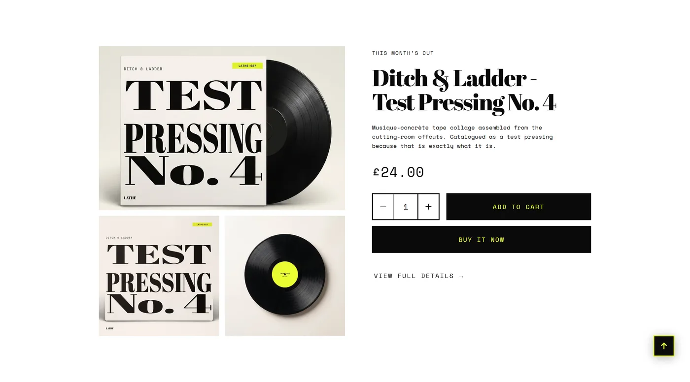
Featured product
Section titled “Featured product”This gives a single product its own section, with the image and the buy controls, anywhere on your site. It is the right choice when one item carries the story: a signature product on the homepage, a bundle on a landing page, or the one thing a campaign is driving traffic to. Product picks the item, then Media position, Media width, and Media layout arrange the photos beside the details. Turn on Keep the media visible while scrolling for long descriptions. Build the right-hand column from blocks: Title, Price, Variant picker, Buy buttons, Description, Text, and Product link. App blocks are supported here too.
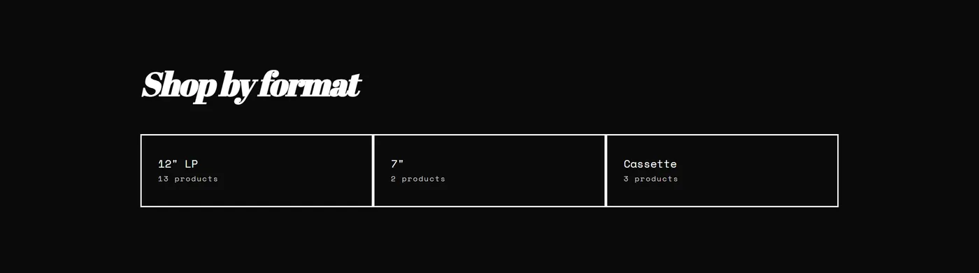
Collection list
Section titled “Collection list”This shows your collections as cards, so shoppers pick a category before they pick a product. Use it when your catalog splits cleanly into groups people already think in, such as room, occasion, or type, and a flat grid of products would make them scroll to find their corner of the store. Add a Collection card block for each collection you want to feature. Show collection images and Image ratio set the visual, while Title placement and Title position (on image) decide whether the name sits under the card or over the photo. Show product count adds reassuring scale, and Enable swipe on mobile turns the row into a swipeable strip on phones.
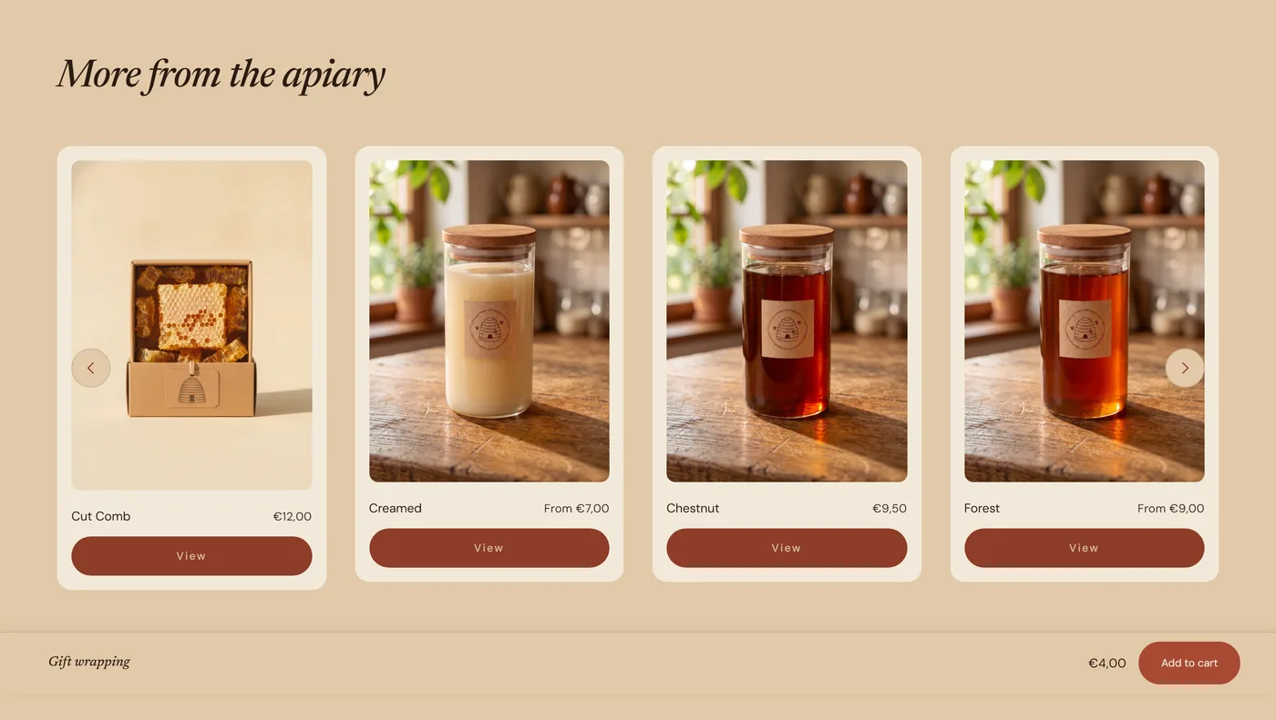
Related products
Section titled “Related products”This sits on the product page and suggests items that go with the one being viewed, chosen automatically by Shopify from your catalog. Add it to your product template when you want browsing to continue after someone reaches the bottom of a page, which is exactly where interest is highest and the next click is cheapest. Products to show and Layout set the size and shape of the row, with Columns on desktop and Columns on mobile handling density. Card action controls what shoppers can do straight from a card, and Show product vendors with Show stock status add detail when brand or availability influences the decision.
Recently viewed
Section titled “Recently viewed”This shows the products a shopper has already looked at during their visit, so they can return to something without retracing their steps. It earns its place in stores where people compare several similar items before deciding, such as clothing sizes, finishes, or price tiers. Add it near the bottom of your product page or your cart page. Products to show sets the length of the trail, and Layout, Columns on desktop, Columns on mobile, and Image ratio match it to the other product rows on the page. Show custom badges carries your sale or new labels through, and Caption adds a short line above the row.
Previous/next products
Section titled “Previous/next products”This adds simple links to the product before and after the current one inside its collection, so shoppers can page through a range without going back. It suits stores where products are genuinely comparable and browsing in sequence feels natural, such as a print series, a size run, or a small curated catalog. It stays deliberately light: Show product images adds a thumbnail to each link, and Show “browse the collection” link gives a third route back to the full grid. Section spacing and Content width align it with the sections above and below.
Quick view
Section titled “Quick view”Quick view opens a compact buy dialog straight from a product card, so a shopper can choose a variant and add to cart without leaving the grid. It has no settings of its own and is not added through Add section. You switch it on with Show quick view under Theme settings → Product cards, and it then works everywhere cards appear. See Product card settings for when it helps and when the full product page does more selling.
Choose the right section
Section titled “Choose the right section”- One product or many: use Featured product for a single item you want to sell on the spot, and Featured collection when you want a group browsed.
- Products or categories: Featured collection shows the items themselves, Collection list shows the doors into them. Small catalogs do better leading with products; catalogs with several distinct groups do better leading with collections.
- On the product page: Related products offers alternatives you have not shown yet, Recently viewed brings back ones the shopper already liked, and Previous/next products walks them through a range in order. Two of these on one page is plenty.