Media sections
These sections exist to put pictures and video in front of a shopper: the opening image on your homepage, a gallery of campaign shots, a film about how you make things, a row of stockist logos. They are the sections you reach for when a photograph will explain your product faster than a paragraph will. You add each one with Add section in the theme editor, and you can drag sections up and down to change the order of the page. Several of them overlap, so this page also says plainly which to pick.
Image banner
Section titled “Image banner”A full-width image with your heading, caption, and buttons laid over it. Reach for this when you have one message to lead with, such as a new arrival or a seasonal edit. Image and Mobile image let you upload a separate crop for phones, which matters because a wide landscape shot often loses its subject on a narrow screen. Height and Height on phones control how much of the screen it fills, Content position and Text alignment place the words, and Image overlay plus Text tone keep the heading readable against a busy photo. Choose this over Slideshow when you only have one thing to say.
Slideshow
Section titled “Slideshow”The same full-width banner idea, but with several Slide blocks that rotate. Use it only when you genuinely have two or three messages of equal weight, for example a sale, a new collection, and a shipping promise. Most shoppers see the first slide and scroll, so put your strongest message there. Autoplay and Speed set the pace, Transition sets how slides change, and Arrows, Pagination style, Pagination position, and Show progress bar decide how visible the controls are. Keep autoplay slow enough to finish reading a heading.
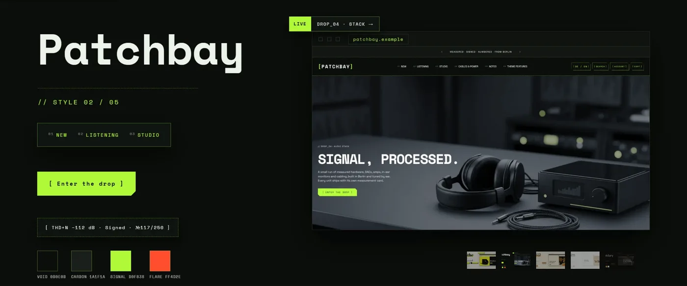
A larger opening section that can hold a video as well as an image, and can put your text beside the media instead of on top of it. Pick Hero over Image banner when you want a Media type of video, or when you want the split arrangement that Layout and Media position give you. Image, Mobile image, Height, Height on phones, Image overlay, and Text tone work as they do on the banner, with matching mobile versions so the phone view is its own decision. A Hero with a short looping video suits brands whose product is best understood in motion.
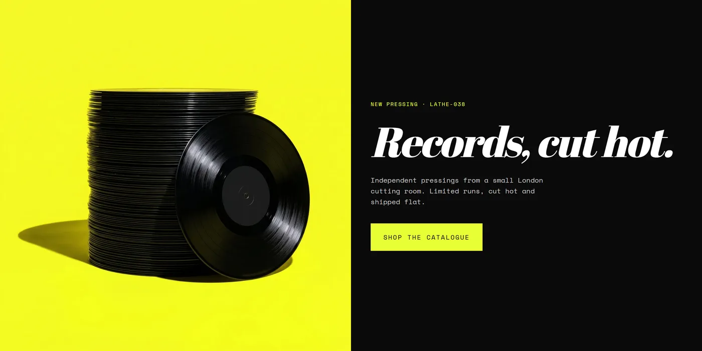
Media grid
Section titled “Media grid”A gallery of Image blocks arranged in a grid. This is your lookbook, your campaign set, or the collection of detail shots that tells a story the product page cannot. Layout, Columns on desktop, and Columns on mobile shape the arrangement, Image ratio keeps every tile the same proportion, Image spacing decides whether images sit apart or nearly touch, and Captions turns on short lines under each one. Choose Media grid when you want images admired, and Image hotspots when you want them shopped.
Media preview
Section titled “Media preview”One video or audio piece given proper room, with a Cover image that plays on click. Use it for a brand film, a founder interview, a podcast episode, or a how-to that deserves more than a few seconds. Media type, Video, and Aspect ratio set the frame, Autoplay decides whether it starts on its own, and Captions file URL with Captions language add subtitles so the piece works with the sound off. Track and Chapter blocks let you list what is inside. Choose this for one long piece and Shoppable video for several short ones.
Before and after
Section titled “Before and after”Two images with a slider between them, plus Before label and After label. This is the proof section for anything with a visible result: skincare, restoration, cleaning, grooming, renovation, repair. It persuades in a way that copy rarely can, because the shopper does the comparing. Add a Heading and Body to say what changed and over how long, then use First button and Link to send people to the product that did it. Photograph both states from the same distance and in the same light so the slider reveals the change and nothing else.
Image hotspots
Section titled “Image hotspots”One photograph with clickable dots placed on it. Use it for shop-the-look styling shots, a room scene, or a kit where several products appear together. Product hotspot blocks link straight to a product, and Content hotspot blocks explain a detail or material. Show numbers on dots and Show pulse animation make the dots easy to notice, and Show list below image repeats them as a plain list underneath, which is useful on phones. This is the section that turns a beautiful lifestyle image into a route to checkout.
Shoppable video
Section titled “Shoppable video”A row of short vertical clips, each a Video slide block, in the format shoppers already know from social feeds. Use it when you have phone-shot content: unboxings, demos, styling clips, customer videos. Video orientation matches the shape of your footage, and Heading, Text, and Heading alignment introduce the row. Keep each clip short and make the point in the first two seconds.
Marquee
Section titled “Marquee”A band of text that scrolls sideways across the page, built from Item blocks. It is a small section that adds a lot of energy between two larger ones, and it suits short phrases: free returns, made in small batches, ships in 48 hours. Direction and Speed set the movement, Tilt angles the band, Separator sets what sits between items, Text case handles capitals, and Pause on hover stops it while someone reads.

Logo list
Section titled “Logo list”A row of Logo blocks for stockists, press mentions, certifications, or partners. Familiar marks build trust quickly, so this section earns its place near the top of a homepage or just above the footer. Layout switches between a still grid and a moving row, with Autoplay, Direction, and Speed for the moving version. Columns on desktop and Columns on mobile set the rhythm, Logo height keeps mixed files looking even, and Logo frame gives each mark its own surface. Use Logo list for marks and Marquee for words.