Page template sections
Every page type in your store has one main section that does its real work. You do not add these with Add section, because they arrive with the template and cannot be removed or reordered. What you can do is configure them, and these are the highest-leverage settings in the theme: a change here affects every product page or every collection page at once, not just the one you are looking at.
To reach them, open the page type you want in the theme editor using the template switcher at the top of the preview, then click the main section in the sidebar.
Product
Section titled “Product”The product page section, with 14 settings and the largest block set in the theme. Layout, Media position, and Media width arrange the gallery against the buy column, while Image ratio, Extra thumbnails, Indicator, and Enable image zoom control how the photos themselves behave. Sticky add-to-cart bar and Sticky bar style keep the buy button reachable on long pages, which matters most on phones.
The buy column is built from blocks you can reorder: Title, Price, Vendor, SKU, Badges, Stock status, Variant picker, Buy buttons, Description, Icon with text, and Personalization. App blocks are supported, so an app you install can add its own block here. Content rows and Accordion behavior control the expandable rows below the buy button, where shipping, returns, and care information usually live.
See Product pages for how to set the page up rather than what each option does.
Collection
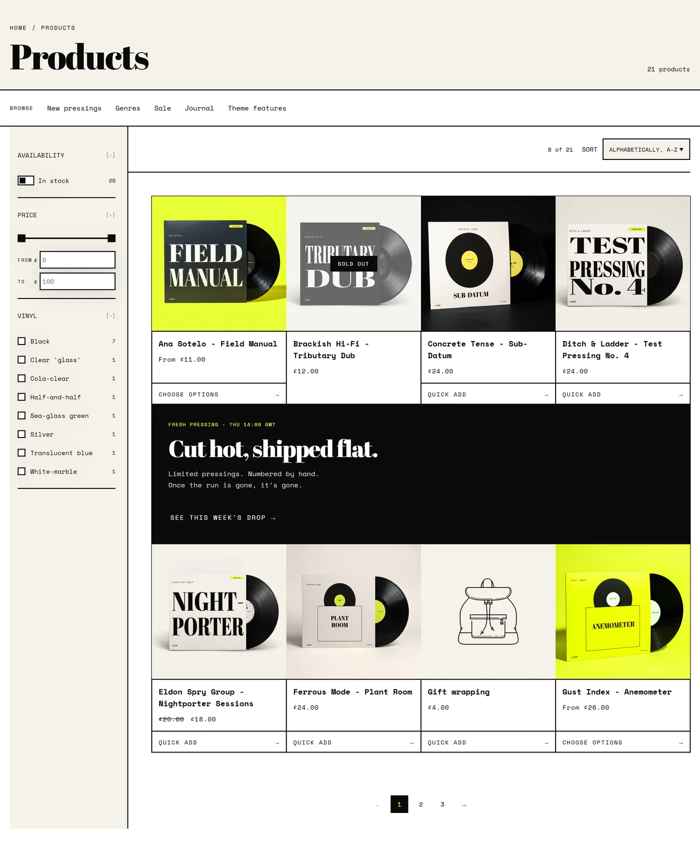
Section titled “Collection”The collection page section, with 28 settings, most of which shape how shoppers narrow a large catalog. Enable filtering, Filter layout, Show result counts, and Enable sorting control the facets. Collection image, Heading alignment, Show the collection description, and Show product count set the header of the page. Quick navigation menu and Quick navigation layout add a row of links to related collections, which is a good way to keep a shopper moving sideways when the current collection is not quite right.
The Promo tile block drops a promotional card into the product grid, so a campaign sits among the products instead of above them. App blocks are supported.
Collections grid
Section titled “Collections grid”The page that lists all your collections, with 19 settings. Layout, Columns on desktop, Columns on mobile, and Space between cards set the shape of the grid, while Image ratio, Title placement, Title position (on image), and Text alignment decide whether collection names sit under their cards or over the photography. Sort controls the order they appear in.
The cart page section, with 26 settings, and the place where most small wins are available. Show free shipping progress displays how close a shopper is to your threshold, which is set in Cart settings. Show order note, Show gift wrapping, and Show a discount code field add optional steps, so turn on only the ones you will actually use. Show low-stock warnings with Low-stock threshold adds gentle urgency where it is true. Show product vendors, Show SKUs, Show item weights, and Show the total weight add detail that suits trade and wholesale stores more than consumer ones. Keep in view while scrolling holds the summary in place on long carts.
The Reassurance block is where returns, delivery, and security notes belong, right at the moment of hesitation. App blocks are supported.
Search
Section titled “Search”The search results section, with 26 settings. Enable filtering, Filter layout, Show result counts, and Enable sorting work as they do on a collection page, so results stay narrowable. Include blog posts, Include pages, and Blog posts and pages to show widen results beyond products, which helps when shoppers search for a policy or a guide rather than an item. Columns on desktop, Columns on mobile, Image ratio, and Let customers change products per row control the grid.
Blog and Blog post
Section titled “Blog and Blog post”Blog lists your articles, with 27 settings. Banner image, Blog description, Feature an article, and Article set the top of the page, and the card options (Show image, Show excerpt, Show author, Show date, Show reading time, Show tags on cards, Show comment count) decide how much each entry gives away.
Blog post is the reading experience, with 30 settings. Reading width is the one that matters most, because it controls line length and therefore how comfortable long articles are. Show a drop cap sets an editorial tone, Show reading progress bar and Show table of contents help with longer pieces, and Show author, Show date, Show reading time, and Show tags carry the byline detail. Show back-to-blog link keeps readers circulating.
The standard page section, deliberately small at 7 settings so your content leads. Reading width, Show a drop cap, and Show table of contents shape long text, while Show breadcrumb, Heading alignment, and Section spacing place it. Use the table of contents on anything longer than a screen or two, such as a size guide or a shipping policy.
Not found
Section titled “Not found”The 404 page, with 15 settings, and worth more attention than it usually gets. It has a Heading and Message you should write in your own voice, plus Background and Background texture. More usefully, it can show products: pick a Collection, set Products to show, and a shopper who hits a dead end lands somewhere useful instead of nowhere.
Password
Section titled “Password”The page visitors see while your store is still locked, with 7 settings. Background image, Image overlay, and Use text wordmark instead of logo set the look, Heading and Body say what is coming, and Show a signup form collects email addresses before you open. If you are building toward a launch, turn that form on early.
Pickup availability
Section titled “Pickup availability”A small section with no settings of its own. It shows local pickup availability for the selected variant on a product page, using the locations you configure in your Shopify admin.